PAW’s Identity Evolution: Built for Scale, Designed for the Future
.svg)
.webp)
In the previous blog, we introduced the new logo and explained why PAW's identity is evolving. Today, we're expanding on what sits behind that symbol and why the broader visual system matters.
Our new logo is the anchor, and the surrounding system determines how it lives:
Why This Move? We Understand.
Before we dive into the pixels, we want to address the baby elephant in the room. We’ve seen a couple of comments and questions floating about since our last update: "Another rebrand?" "Why another migration?"
We understand.
In a space where projects often change their look just to distract from a lack of progress, asking a community to walk through a structural transition is a big request. We touched on the "why" in our last blog - explaining how we outgrew our meme-culture origins - but to truly understand why this move is required today, you have to look at the hurdles we’ve cleared behind the scenes over the last year.
The reason we are moving through this transition in a controlled sequence rather than just dropping a new name and a link is because the PAW of 2023 was a decentralized experiment, but the PAW of 2026 is a tech infrastructure firm.
The Journey of Refinement
Throughout 2025, while the public-facing side of the project likely seemed quiet, the internal team was undergoing a "trial by fire." We weren't just updating a chain; we were making fundamental decisions about the next decade of security.
- The Security Shift: We spent months integrating with enterprise-grade custodians like Fireblocks and Coincover. That process required a level of technical compliance and structural rigor that the original PAW framework simply wasn’t built to house. These partnerships served as a vital bridge at the time, allowing us to develop the standards required for the next phase of our evolution
- Future-Proofing: Having established those standards, we have since moved toward full technical sovereignty by implementing our own Post-Quantum (Dilithium-V) security. This wasn't a "nice-to-have" update; it required a structural reset of the network's signature mechanics.
This journey - from a community-born DEX to a quantum-resistant, hyper-performant, infinitely scalable, universally compatible layer with unified liquidity - is why a "new coat of paint" wasn't enough.
You don't put a supercar engine in a go-kart frame. We are building the frame to match the engine.
Color Palette
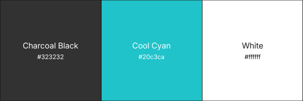
This palette is built to support both dark and light environments and to remain comfortable for long sessions inside tools and dashboards.
Charcoal Black is our base coat. It provides depth, seriousness, and a neutral substrate for complex interfaces.
Cool Cyan is used as our signal color. It highlights interaction points, important actions, active states, and introduces energy without overwhelming our UI.
White ensures clarity, spacing, and readability.
Color Psychology and Strategic Intent
The new color system was selected intentionally. Charcoal tones anchor the ecosystem in stability and technical seriousness. They create a calm, focused working environment, especially within dashboards and applications. Cyan acts as a precision signal color: representing clarity, intelligence, and forward movement. It guides interaction without overwhelming the user.
White space ensures readability and accessibility, keeping the ecosystem open to both advanced users and newcomers. Together, this palette balances power with approachability, reinforcing that PAW is engineered for scale while remaining community-driven.
Typography
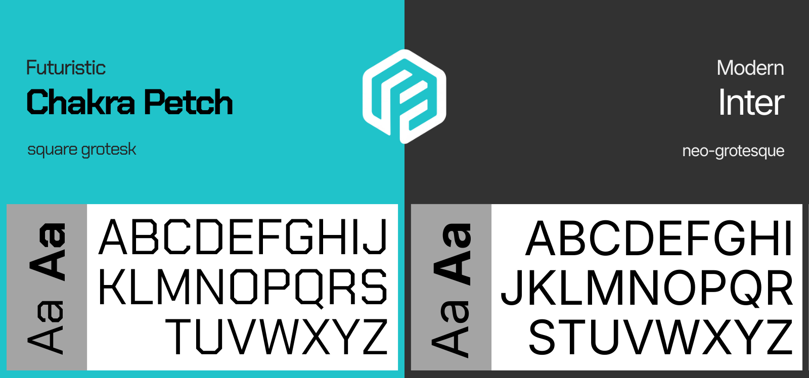
Two typefaces connect our new system.
Chakra Petch is used for headlines and key technical surfaces. Its geometric construction, sharp angles, and mechanical character reflect a technical backbone and forward-leaning foundation. Chakra Petch is used within the unrevealed stacked and horizontal logos for the new network name when it is introduced.
Inter is used for body text and UI. It prioritizes readability, balance, and efficiency across screen sizes and devices. This blog post you are reading is set in Inter, the same typeface we've used across PAW products and interfaces since 2024.
Together, they balance the precision and approachability we're aiming for.
From Ecosystem to Platform
Months ago, we spoke about expanding beyond isolated tools and positioning PAW as a foundation connecting Web2 and Web3. That direction has not changed.
Scanner, wallet, validator tools, routing layers, and ecosystem access points are not meant to live as separate fragments. The long-term vision is coordination under one coherent surface.
The new dashboard structure will reflect that unification. Community users and enterprise users will each have tailored surfaces, but both will operate within the same coordinated system.
PAW is no longer a collection of experiments. It is becoming a platform.
What This Identity Is Being Built To Support
One of the clearest examples of that direction is our upcoming launchpad.
The new launchpad is being designed to offer multiple token distribution formats depending on project needs. Rather than forcing every deployment into one structure, it supports individual approaches to fundraising, distribution, and market entry.
These will include:
- Structured curve-based launches with automated liquidity creation
- Equal-entry distribution models designed around fairness
- Controlled presale formats for teams seeking tailored allocation
- Direct-to-market deployments paired with ecosystem liquidity
The objective is consistency and alignment.
Distribution should be transparent and liquidity should not be an afterthought.
Access should not depend on hidden advantages and value generated within the system should reinforce the broader ecosystem rather than extract from it.
Further detail around mechanics will be shared in its own release. For now, what matters is the principle.
Why Structure Matters Before Growth
As PAW prepares for the relaunch, structure becomes essential. Growth without alignment creates noise. Growth with structure creates momentum. The updated brand identity provides a foundation that allows marketing, partnerships, enterprise onboarding, and community expansion to operate under one consistent framework. It strengthens positioning without needing to over-explain strategy. A strong visual and structural system communicates readiness, and readiness is what this next phase represents.
Community and Enterprise, Not Either-Or
While PAW is expanding into enterprise-level infrastructure, this does not replace the community layer - it strengthens it. A more structured platform enables broader adoption. Broader adoption increases network activity. Increased activity reinforces ecosystem value. The community remains central to PAW’s identity. The refreshed brand ensures that as PAW grows outward, it does not lose its core energy. It simply scales it with intention.
Preparing for the Relaunch
All elements - the security upgrade, the unified dashboard, the refined brand system, and infrastructure alignment - are being coordinated to move in sequence. Nothing is random. Nothing is rushed. When PAW returns , the ecosystem will not only be technically upgraded; it will feel cohesive. The identity will match the architecture. The platform will match the ambition. This preparation phase ensures that relaunch is our evolution.
This series will continue in stages. The logo was the first visible step, and our identity and platform direction are now becoming clearer.
The new name, migration details, and deeper technical specifics will follow soon in structured order.
For now, what remains constant is the foundation - accessibility fairness, user-first design, and long-term thinking.